POTS Link - Campaign Launch
Logo Design | Packaging Design | Photography | Campaign
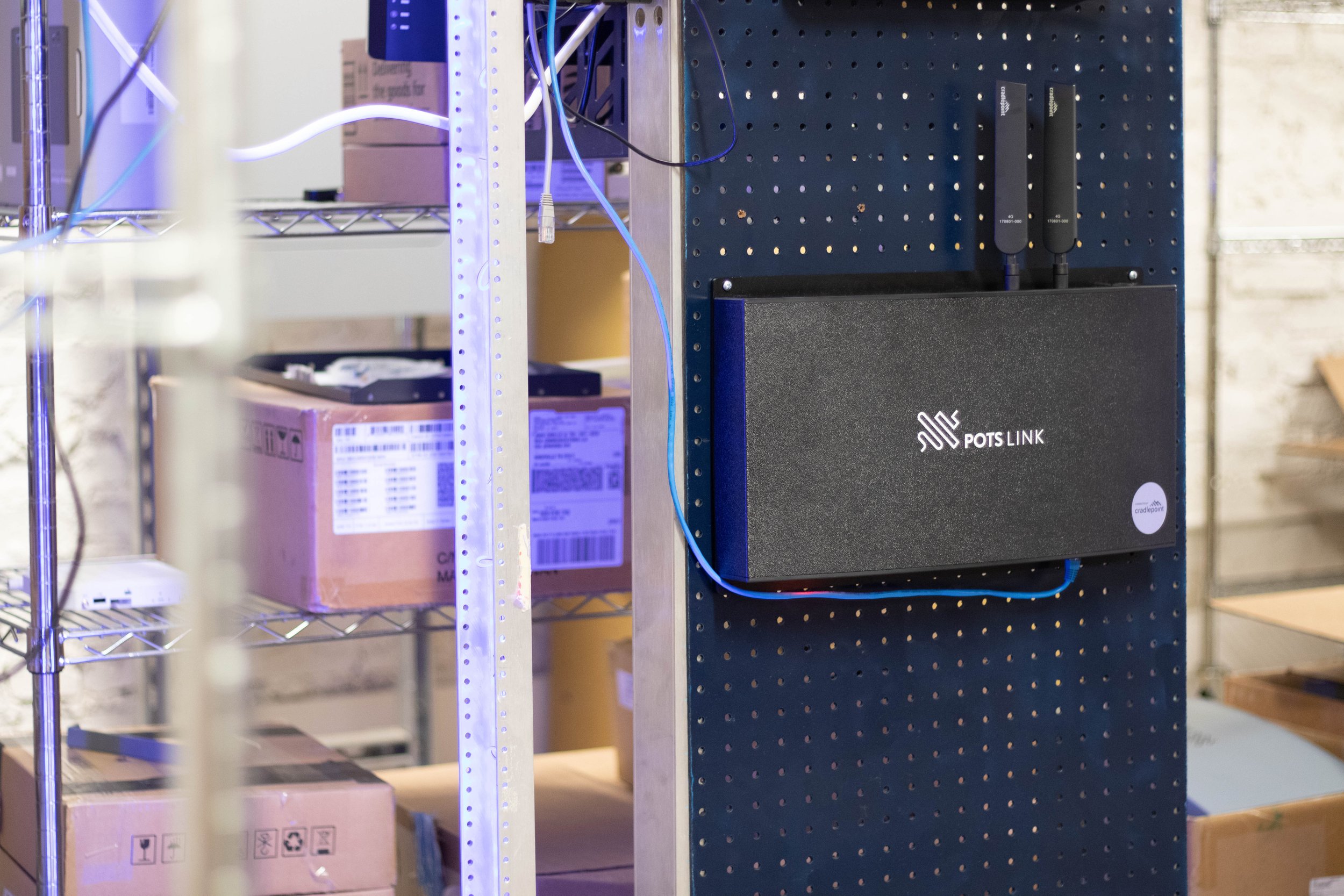
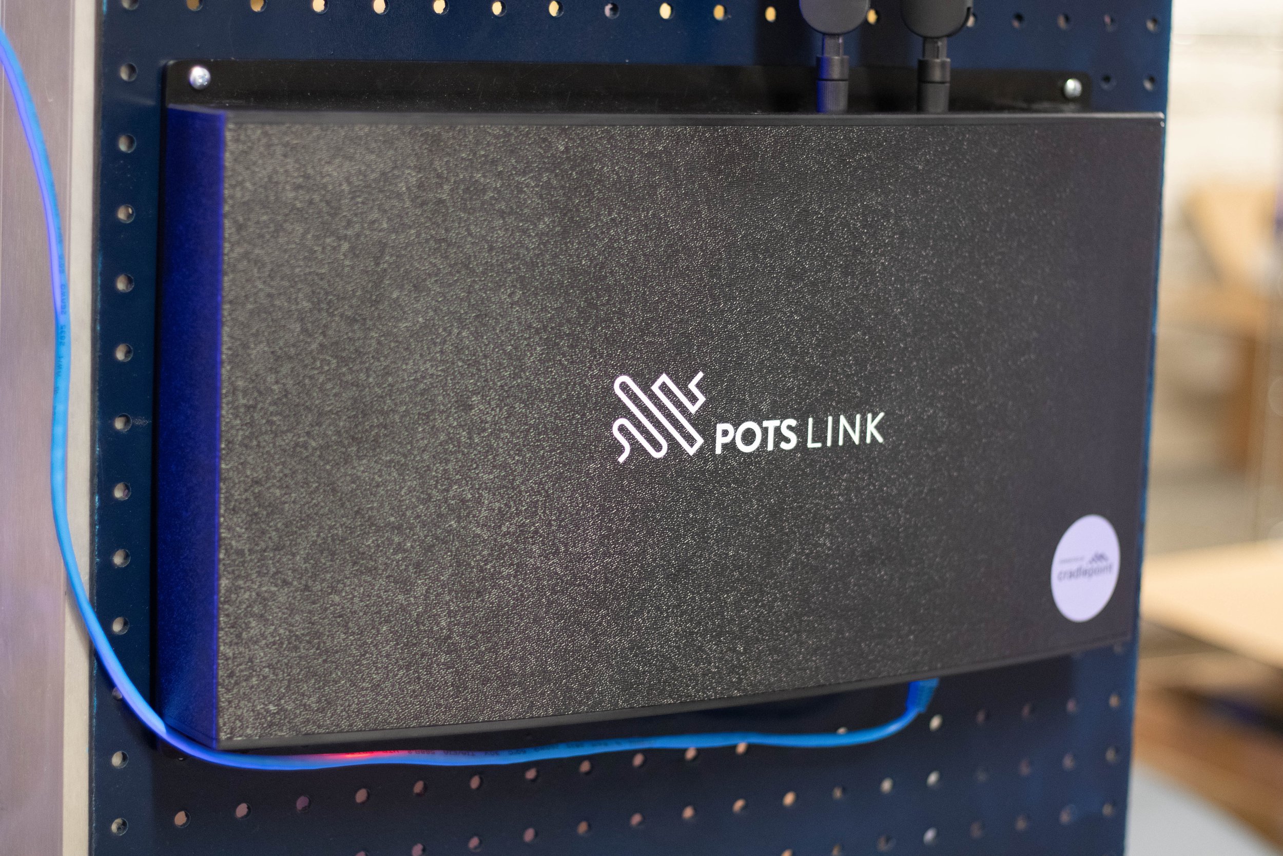
The POTS Link branding for RCN Technologies highlights the transformative nature of analogue-to-digital conversion for POTS line replacements. To visually represent this, the logo features flowing analogue lines that transition into structured digital forms, symbolizing the conversion process. The minimalist design and clean lines in the art direction reinforce POTS Link’s focus on cutting-edge technology and modernization. Together, the logo and art direction capture POTS Link’s role in advancing digital signal solutions, presenting a sleek and tech-forward image that resonates with the brand’s market position.
Learn More: Pots Link Case Study