
C3 Training - Branding Breakdown

Creating the Logo and Brand Identity for C3: A Journey of Strength and Style
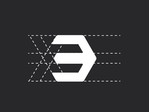
In the competitive world of fitness, branding plays a crucial role in attracting customers and creating a distinct identity. C3 Training, a prominent gym based in Sydney with multiple locations, understood the importance of a strong logo and brand identity to reflect their values and captivate their audience. In this blog, we will explore the process behind the creation of the iconic C3 logo and how it perfectly matches the energetic vibe of the facilities. With black as the highlight bold color of choice, the logo's hexagon shield design cleverly incorporates the C and 3, symbolizing the strength and unity that C3 represents.

Understanding the Essence of C3: Before diving into the design process, it was essential to comprehend the core values and vision of C3. The team at the gym believes in empowering individuals, fostering community, and promoting a healthy lifestyle. These key aspects became the guiding principles in shaping the logo and brand identity.
Conceptualizing the Logo: We embarked on a creative journey to conceptualize a logo that would encapsulate the essence of C3. Inspired by the idea of strength, unity, and geometric precision, they developed the concept of a hexagon shield as the main visual element.
Incorporating the C and 3: To make the logo uniquely identifiable, it was important to integrate the gym's initials, C and 3, into the design. By combining the two letters within the hexagon shield, a powerful and visually appealing symbol was created. The seamless fusion of the C and 3 represents the synergy of community and individual growth that C3 promotes.
Choosing the Bold Highlight Color: To infuse energy and dynamism into the logo, the designers opted for black as the highlight bold color. Black signifies strength, determination, and a sense of sophistication. It also serves as a perfect complement to the other elements in the gym's branding, creating a cohesive and impactful visual identity.
Reflecting the Energetic Vibe: C3 is known for its high-energy workouts and moody atmosphere. The logo successfully captures this spirit by combining sleek lines, sharp angles, and a modern aesthetic. The hexagon shield, with its geometric precision, exudes a sense of power and stability, reflecting the gym's commitment to helping individuals achieve their fitness goals.

Consistency in Branding: After finalizing the logo, the designers extended the visual identity across various touchpoints. This included creating a brand style guide, selecting complementary fonts, and designing marketing collaterals. The cohesive branding ensured that every interaction with C3 reinforced its core values and left a lasting impression on customers.
Creating the logo and brand identity for C3 was an exciting journey that resulted in a visually striking representation of the gym's values and energy. The hexagon shield design, incorporating the C and 3, perfectly captures the strength, unity, and community focus of C3. With black as the highlight bold color, the logo stands out and creates a powerful brand presence. The logo and brand identity successfully reflect the energetic vibe of C3's facilities and position the gym as a leader in the fitness industry.

Project Collaborators
Photography - Lincoln Magee
Signage - Savvy Sign Co