The Grounds Roastery - Single Origin Rebrand
Logo Design | Packaging Design | Campaign | Creative Direction
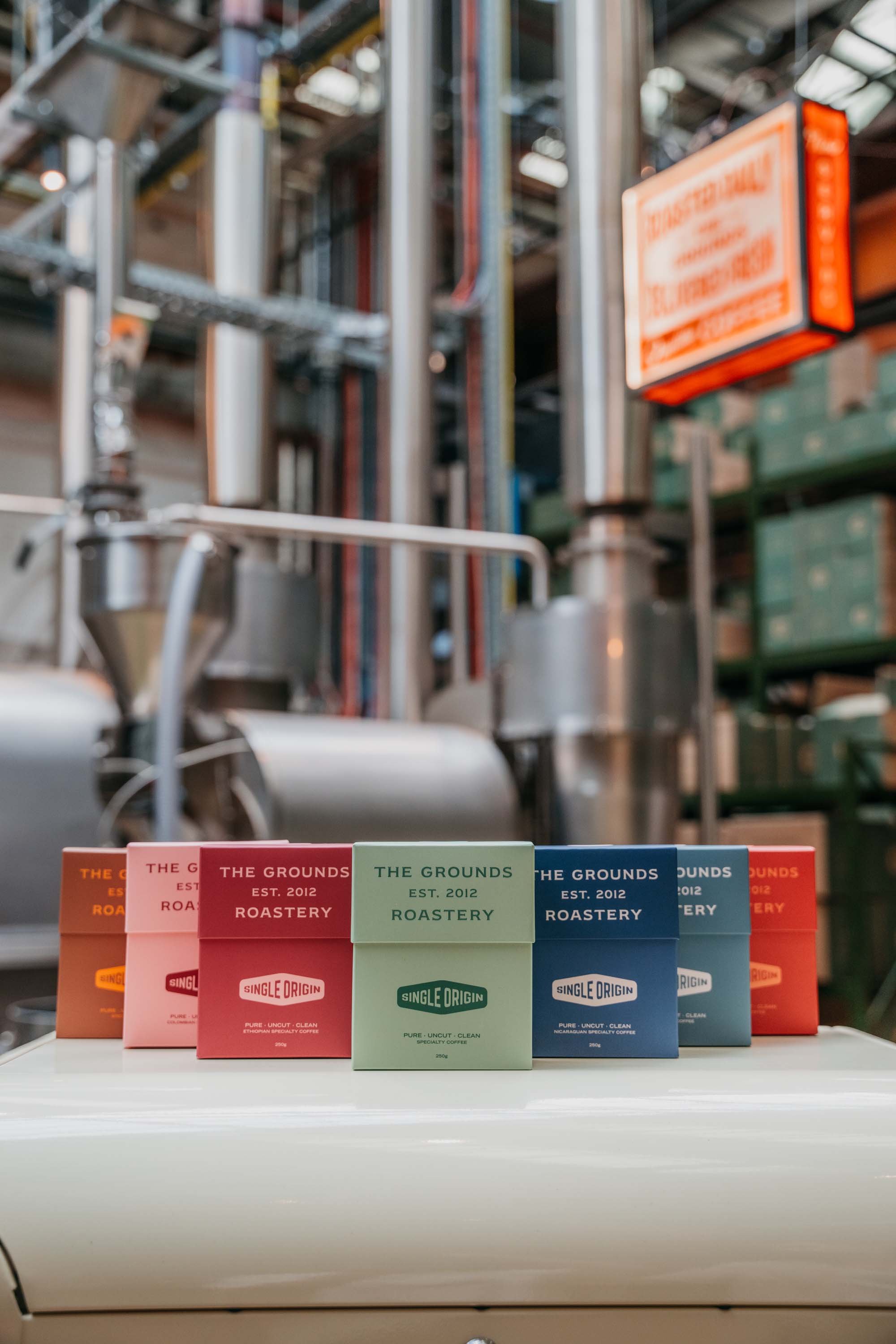
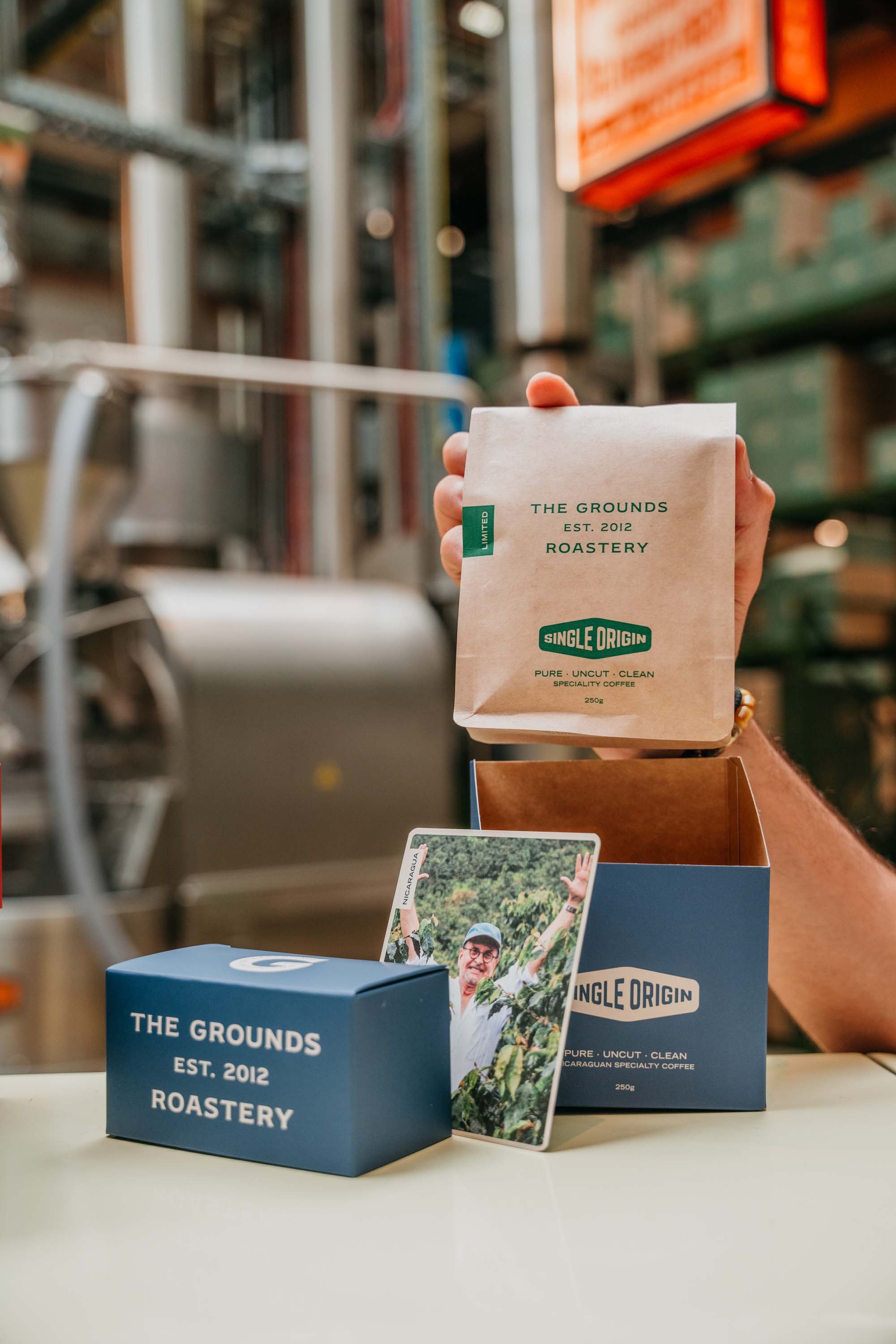
The Grounds' Single Origin coffee packaging is a masterclass in coffee roastery branding and creative direction. Each bold Pantone colour represents the coffee’s unique origin and flavour profile, creating a visually striking yet refined design. A custom icon lockup reinforces quality, seamlessly integrating with the minimalist aesthetic. The kraft bag, inspired by traditional hessian sacks used for green bean transport, adds authenticity and a connection to the coffee’s journey. This rebrand highlights how strategic design can honour a coffee roastery’s heritage while elevating its product to a premium standard.